 Typica: Software for Coffee Roasting Operations
Loss By Item and Operator
Lately I've been drafting a piece on different ways to measure consistency in roasting. There are several consistency metrics that a roaster can look at such as various measures of how closely roasting data matches the roasting plan, percent weight loss, color, and sensory evaluations. These all have their own advantages and limitations and there are also metrics that people have told me they would like to use as a consistency metric which really do not work at all and can lead to greater variation in roasting. One of the reasons that I'm interested in this is that there are several features in Typica that are motivated by potential improvements in consistency. When working on such things, I like to compare data from before and after making such a change. If roasting becomes less consistent after I introduce a feature, I should probably roll that back.
One thing that you might want to know when looking at this sort of data is if different people are roasting the coffee in different ways. Since Typica 1.8 introduced fast user switching, making it more likely that companies will have things set up to track batches by who roasted them, and since Typica can very easily calculate percent weight loss data for every batch roasted, I decided to create a new report that summarizes this information.
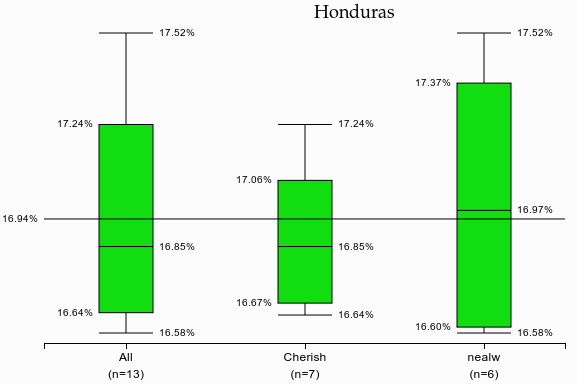
Reading this sort of information from a table is hard so I decided to go with box plots. The new Weight Loss By Item and Operator report goes through all of the roasted coffee items that are set as current items. It only includes batches that used the same green coffees as the most recent batch and it only includes batches that have the approval check box set. I might add some additional filter options and ways to dig into the underlying data to the report later, but for now I just wanted to get the basic feature working.
Reading the chart, at the top you'll find the name of the roasted coffee item. A line running across all of the boxes shows the mean loss for all batches. Next are the box plots. The top and bottom lines show the highest and lowest losses. The box shows the 25th, 50th, and 75th percentile, interpolating for these values if needed. There's one plot for all of the selected batches and then an additional plot for every person who roasted that coffee. This means that if only one person is roasting, you still get two boxes. On the x axis you can see who was responsible for the batches summarized in the box and the number of batches represented.
It's important to remember that percent weight loss is only one metric of consistency and not the most important one. It's certainly possible to match this very closely while not matching on flavor, but this does provide a convenient way of comparing how different people are roasting coffee.
This will be in the next release of Typica, but if you're interested in trying it out on your roasting data now, you can find the report in the development branch on GitHub and just drop the lossplots.xml file into your Reports folder.